
GATESHEAD INTERNATIONAL FILM FESTIVAL LOGO DESIGN


More logo deisgns! I find logo designs a real challenge, simply because they are so vital to a business. It has to relect the identity of the promotion / business / event it represents and be instantly recognisable when people are scrolling
I always like being tasked with a logo design and talking to / working with the people behind the brand to truely create something that they will love and use to really generate interest in their company
The Gateshead International Film Festival is being run by ANBOC films and they are looking to promote independant films and draw film lovers to the beautifuk North East
My first direction was simple try and capture the spirit of Gateshead and use concepts such as the Millenium Bridge (as opposed to the Tyne Bridge), A Gate and Goats - which is how the town got its name, apparently it had a hill that goats used to frequent a lot (which was news to me as i thought it was the gate of Hadrians Wall)
In addition to that we chose to use the colour scheme of the Gateshead City logo - Blues, Golds ad Greys / Silvers
We are trying to capture the true spirit of Gateshead. Historically, the town's original name was Goats Head because of a hill or a mountain where goats were seen. A goat on top of a mountain or a hill also represents tenacity, resilience and the pioneering spirit to pursue our goals no matter the challenge, and a bridge or a gate being the symbol of connections/collaboration and opportunities for filmmakers.
Logo Concepts 1 - Print Ready Silhouette
You have to start somewhere! Using the Laurel wreath that is common in film festivals and doubling down on the concept of a goat climbing one of the Bridges

Logo Concepts 2 - The Golden Goat
The main idea behind this logo was to also use the design as a basis for an awards statue - in similar style to the BAFTA face - but of a Golden Goats Head
In my usual style - I went for the more is more mentality
Each logo had a film reel motif, a Bridge, a specific Goat Icon and the Blue and Gold colour scheme of Gateshead


Logo Concepts 3 - Bridge Horns
I really stripped back the next wave of ideas and lost the gold colourway - using a more sleek silver and blue. The idea here was to use the twin arches of the Millenium Bridge a horns on the goat
I even scaled the logo back even further and used a slim line, script style look

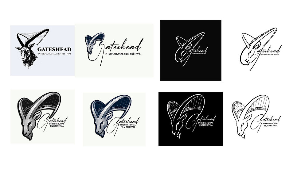
Eventually the final design was decided and the GATESHEAD FILM FESTIVAL takes place on 16th - 18th of July 2027
I am delighted to have created something that the ANBOC team love and look forward to seeing all the films that take part in the festival




Comments