
Whitby Town FC Dracula Kit Redesign
- Rob Maltman

- Jul 29, 2025
- 3 min read
Updated: Aug 9, 2025

I love shirt design and my eventual career in darts shirt design was inspired by a life long love of football shirt design and football shirt collecting.
My favourite factors when it comes to a football shirt is celebrating local icons and culture - Its very easy to forget, in the world of world wide brands in the Premier league, that football is still a key part of the local landscape and a reflection of the local cities and towns in which they operate. Certainly the lower down the leagues you go.
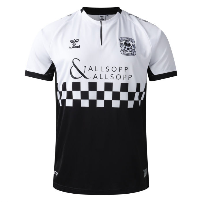
One of my all time favorite football kits that does this is the Coventry City 2019 / 2020 away shirt that features the two-tone branding that reflects the mod culture and musical history of the city - its perfect for that city and its fans.
When I saw that Whitby Town was releasing an away shirt that reflected the towns links to the novel Dracula I was very excited to see the result. Whitby has a rich history with the novel and hosts a huge gothic event every halloween, has a dracula museum in the town and a giftshop in the Abbey itself - This could of been an all time classic football shirt that transcends Whitby Town and standard football shirts.
But after having seen it - In my opinion - it doesn't go far enough with the Dracula theme and doesn't truely reflect the towns gothic roots. Most obviously, its PINK.
As a football shirt - its perfectly fine but as a design that is meant to celebrate the towns Dracula connection - I think it misses the mark.

Yes there is a sillouette of the Abbey, Bats and a full moon - all classic vampire motifs - but i feel there could be more to the overall shirt.
I decided that I had to do my own Whitby Town FC Dracula Kit Redesign - and attempt to improve the shirt, that has a brilliant concept but not great execution
I started with asking ChatGPT for their version and it cam out a classic red and black pinstriped shirt. That I think is a huge improvement on the official Whitby Shirt

My design started with a black base - the obvious colour for a gothic theme and rather than a red trim like the AI version I opted for a blood effect instead. Starting with a bleeding look on the sleeve trims. I considered a red collar, but went with a grey to subtly stand out from the black body and put two blood spots on the 'neck' and a 'blood spill' down that side - its a classic part of Dracula lore and reflected in the new design
I added the Whitby Abbey sillouette but transformed it from white to black - Vampires only come out at night and the Abbey looks much more forboding in black than white. To contrast the black shirt with the black body I added the glowing full moon to highlight the Abbey.
This was enhanced with a flock of bats flying across the moon above the abbey
On the back of the shirt I removed the images and focused on the name and number of the player - but included the classic Vlad the Impaler image of bodies being skewered ver subtley within the black pattern - not to take away from the overall design
I left the blood stain on the neck so it flows from front and back

Having completed the design - I put my money where my mouth is and sent it direct to the club, as well as pushing on social media to see what peoples opinions are


Comments